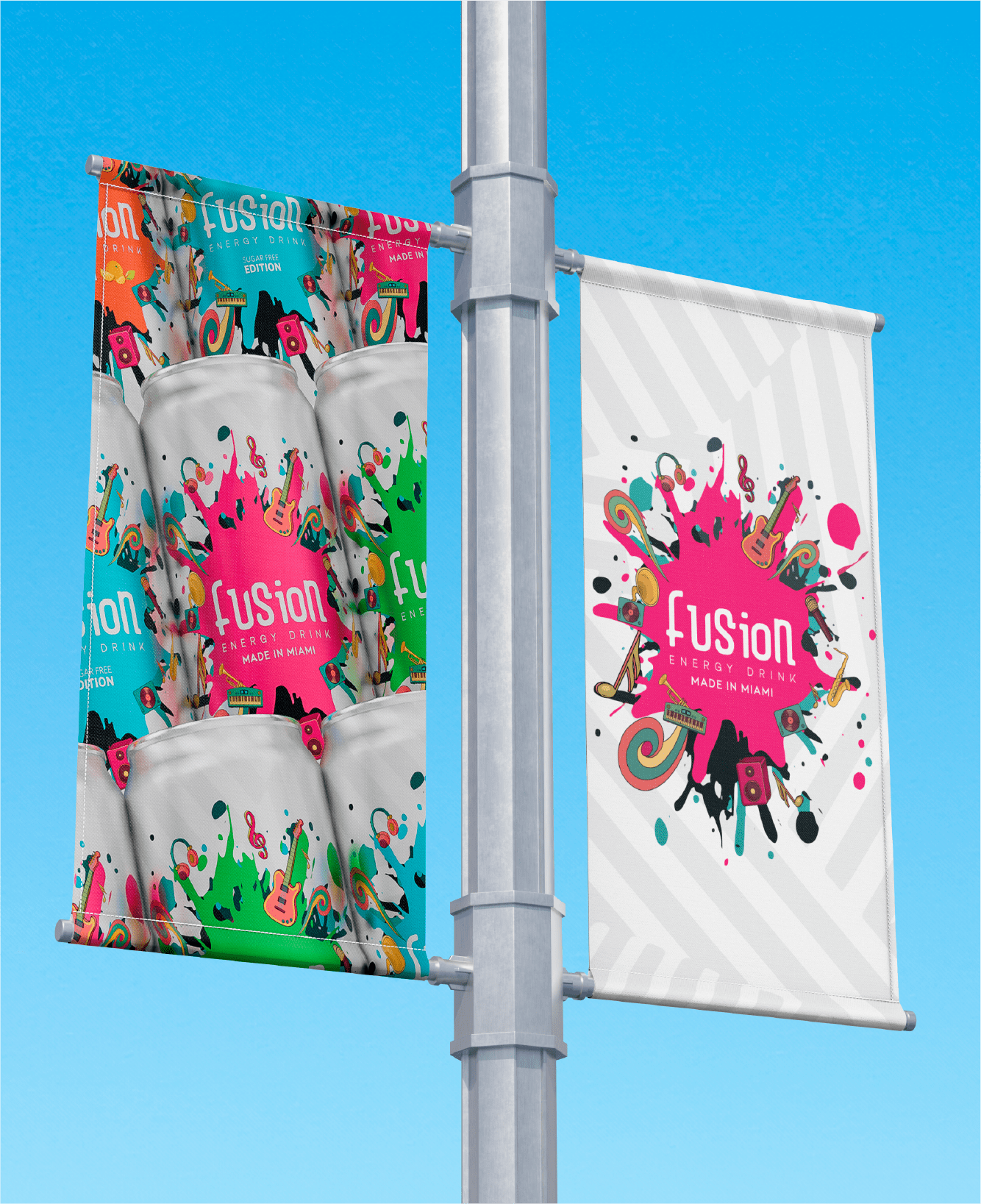
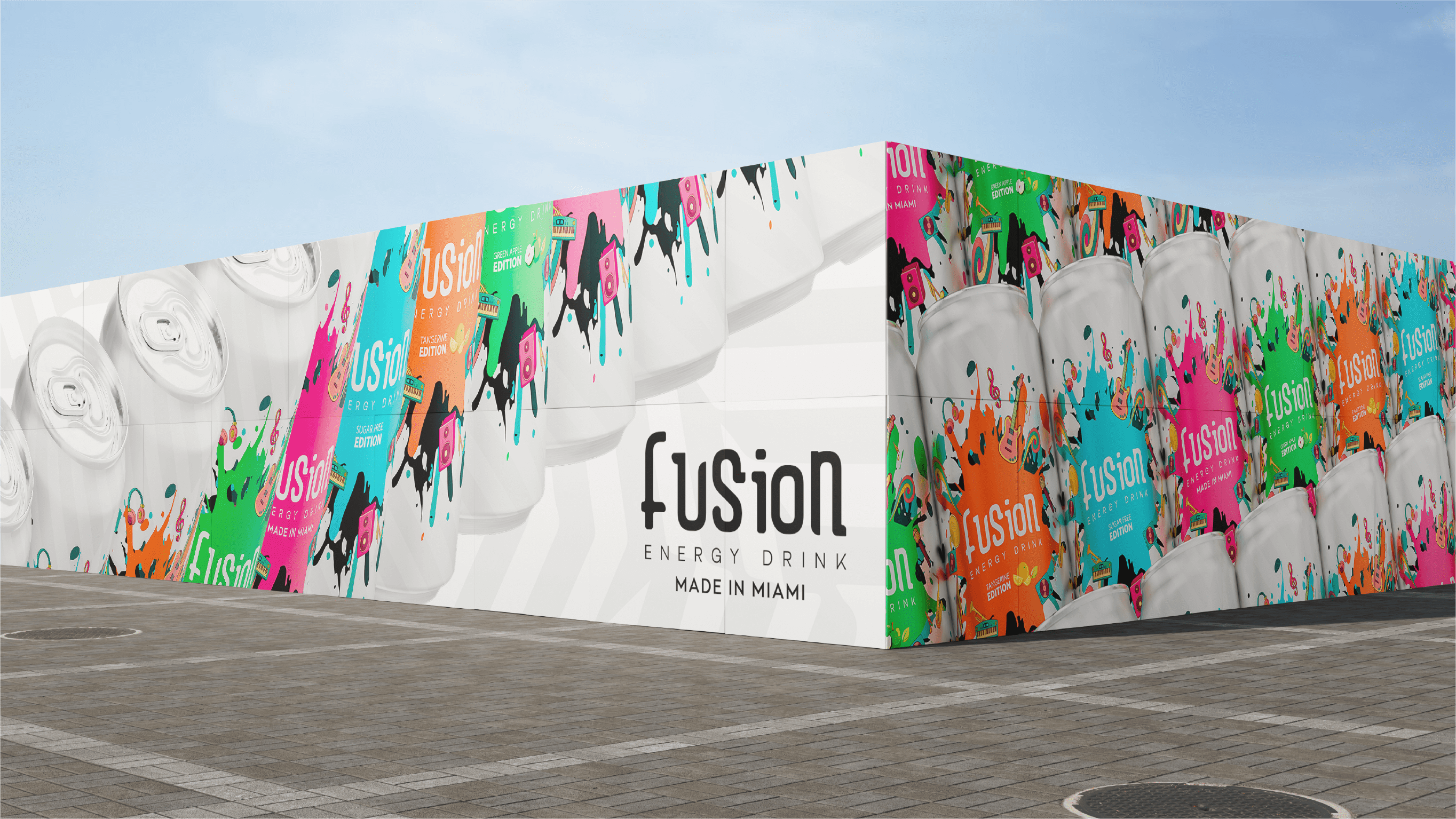
Fusion . brand identity + packaging

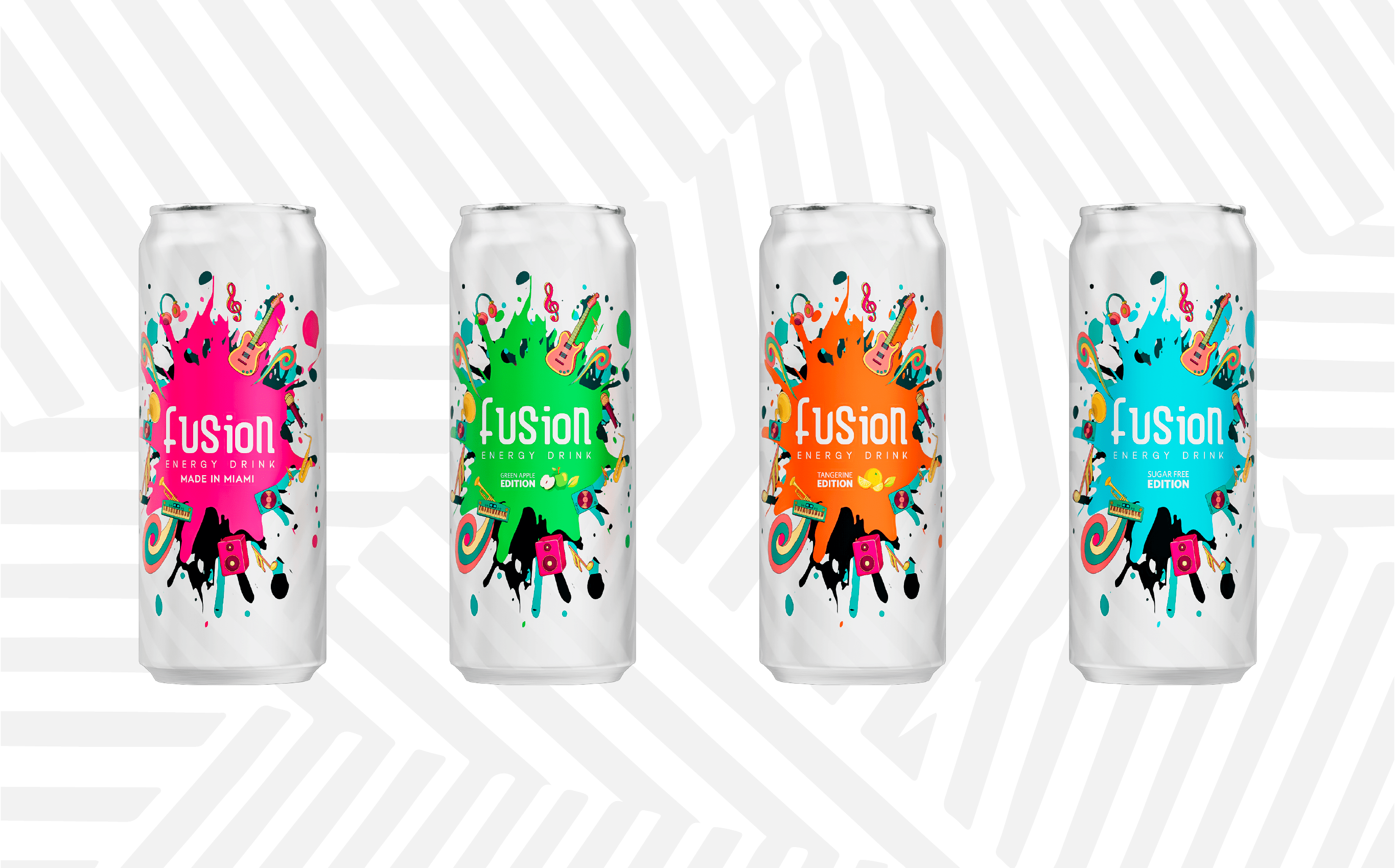
Developed for a U.S. market launch, this rebrand represents the evolution of a Brazilian energy drink entering a new creative stage. Inspired by Miami’s cultural vibrancy, the concept embraces rhythm, color, and movement as core elements of the identity.Bold color palettes, dynamic compositions, and expressive layouts define the visual system, reflecting the city’s artistic energy and diversity.

Every design decision was made to feel energetic, inclusive, and contemporary. The result is a confident and modern brand presence designed to stand out and connect in a highly competitive market.
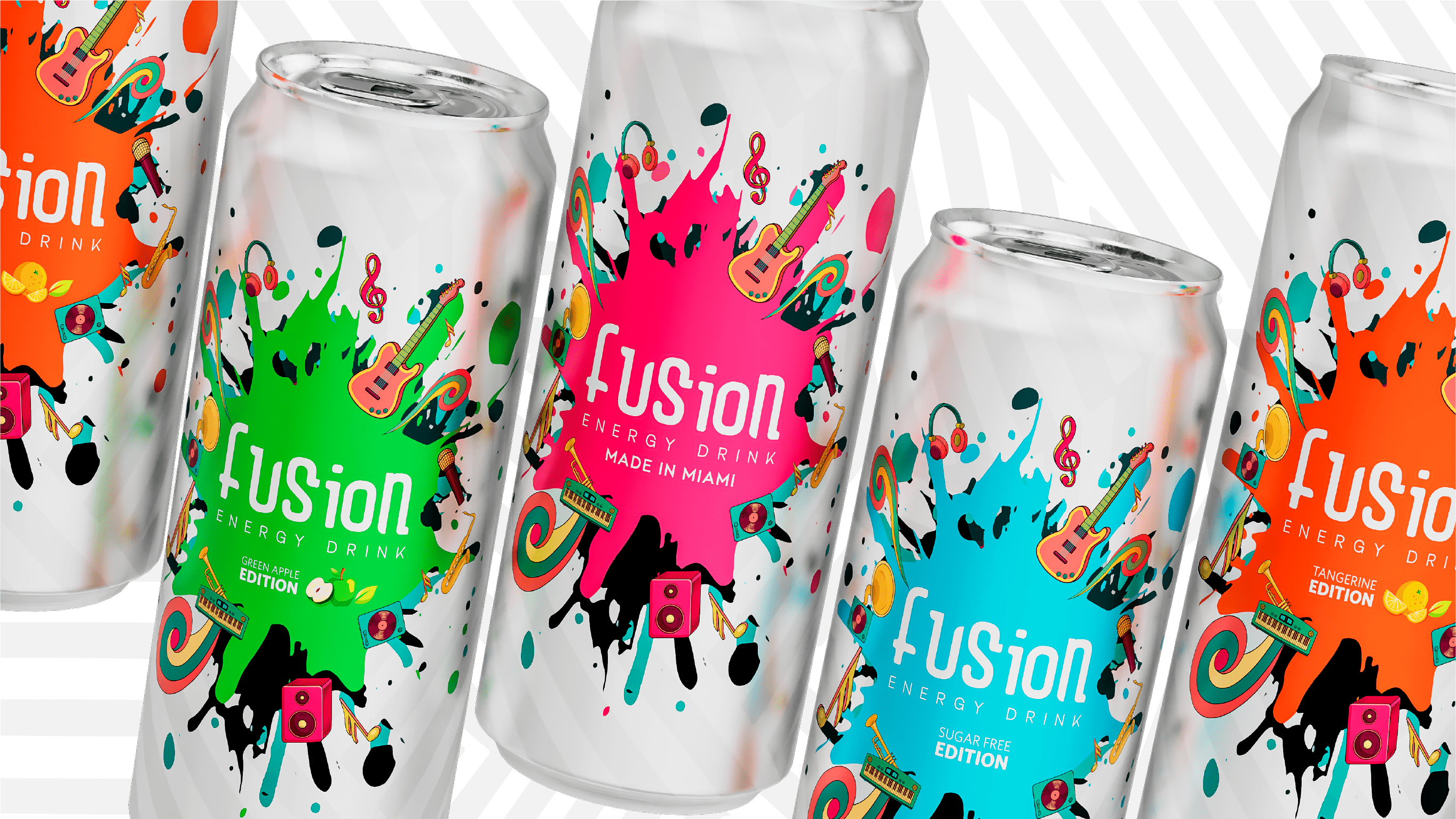
Fusion was created as a new energy drink brand developed for the U.S. market. Rather than following the category's familiar focus on extreme sports and performance, the opportunity was to build something inspired by Miami's creative energy. Drawing from the city's art scene, cultural diversity, and vibrant atmosphere, the goal was to create a brand with a distinct personality and a stronger connection to the people and communities that make Miami unique.
The challenge was to develop an identity capable of standing out in a highly competitive market while offering a fresh alternative to the visual language commonly found in the energy drink category.
The strategy was to approach the category from a different perspective. Instead of following the familiar energy drink formula built around performance, adrenaline, and extreme sports, the focus shifted toward culture, creativity, and self-expression.
Miami became the foundation of the brand, serving as both a visual and cultural reference point. Inspired by the city's art scene, creative communities, and vibrant atmosphere, the identity was designed to feel bold, energetic, and full of personality.
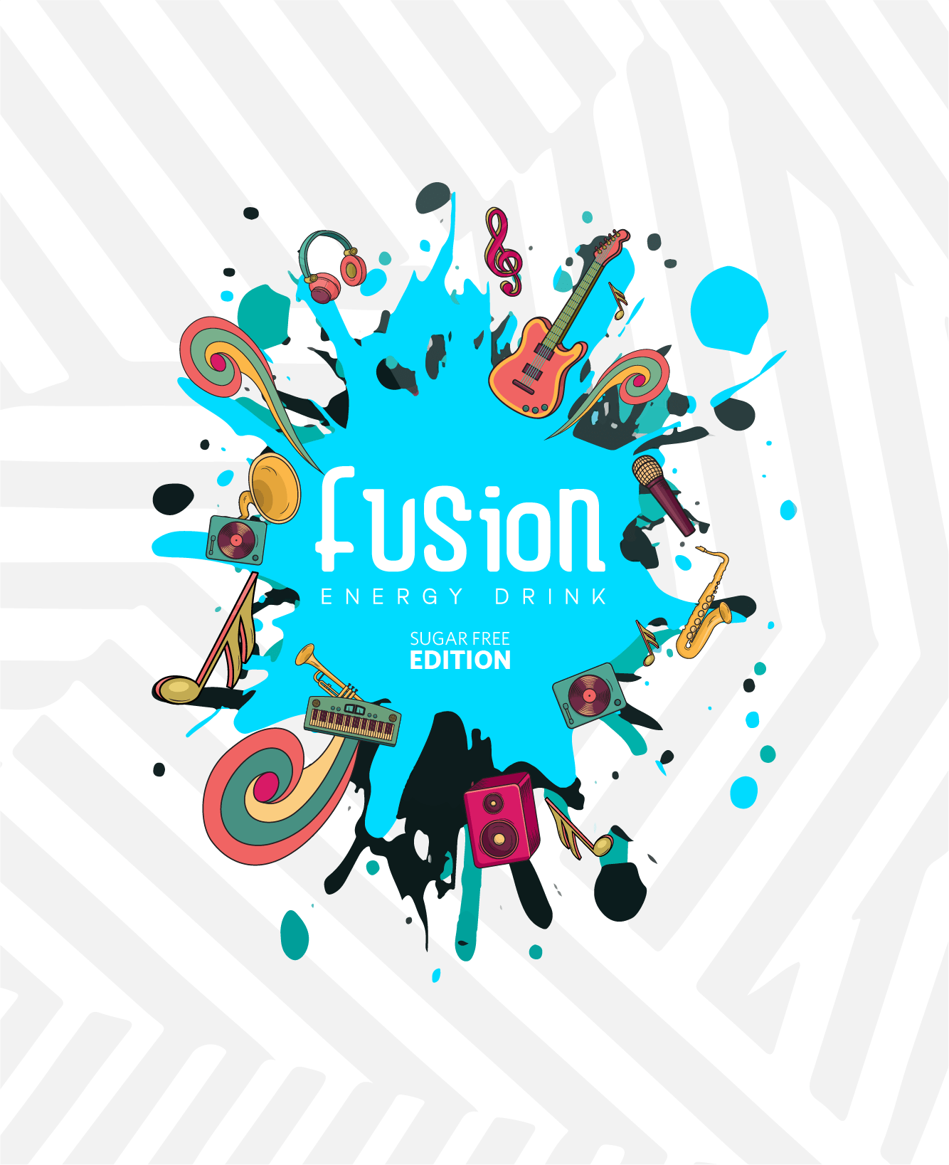
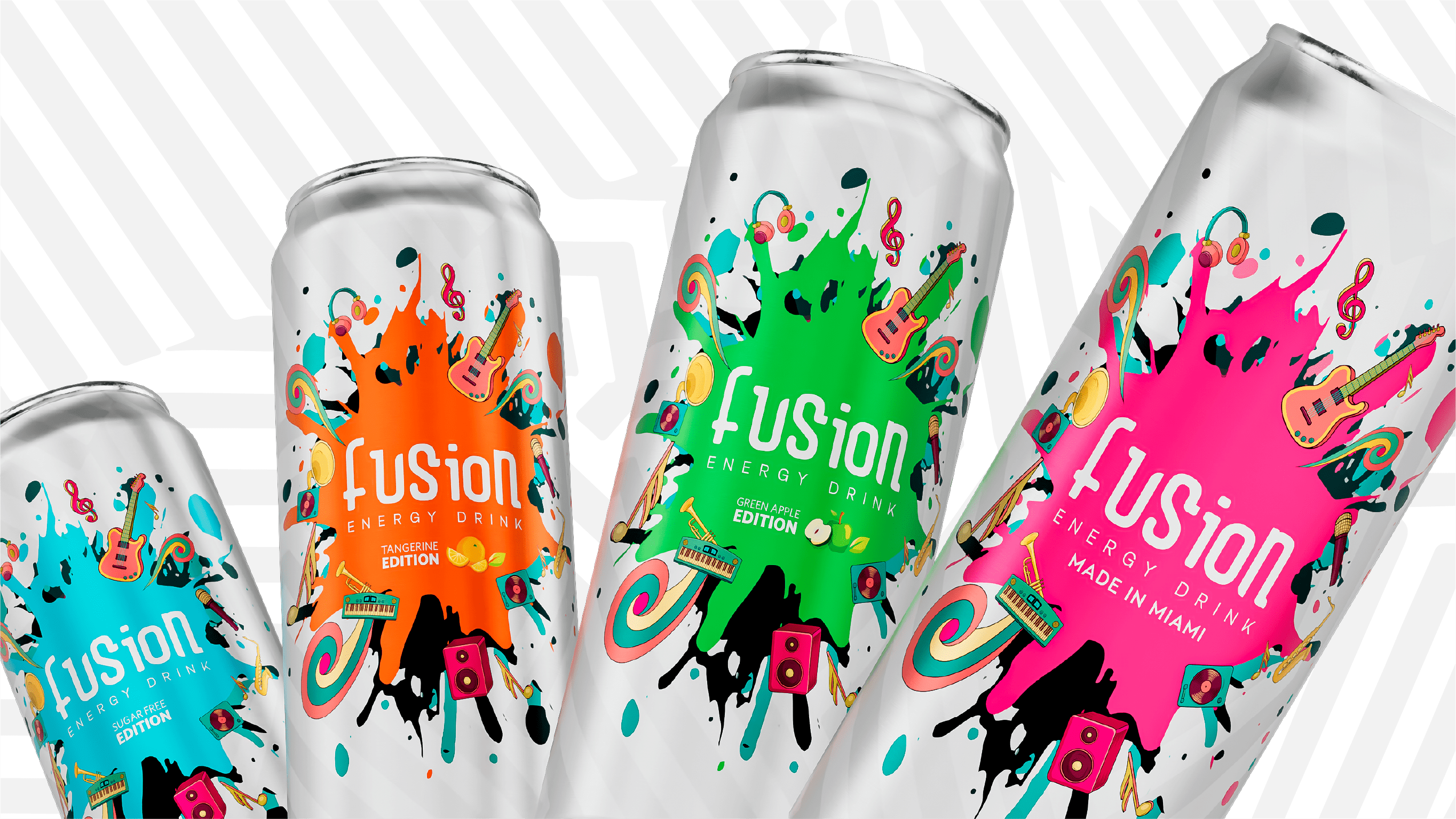
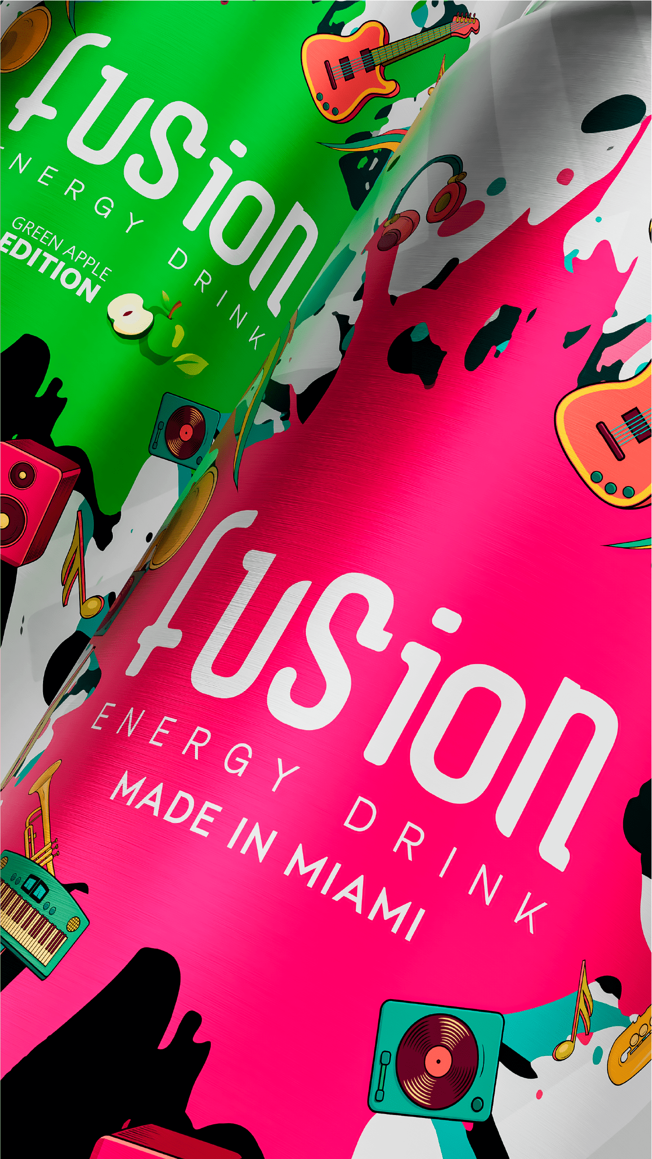
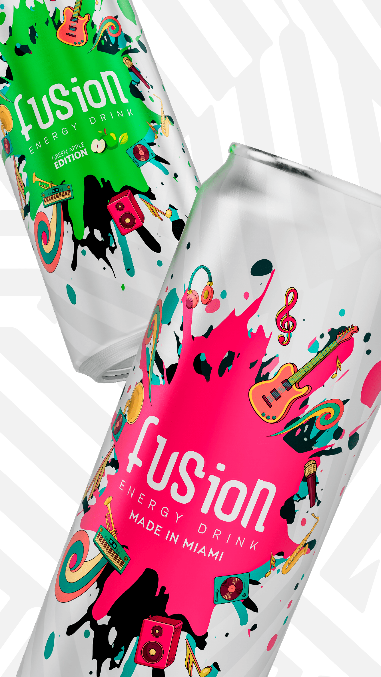
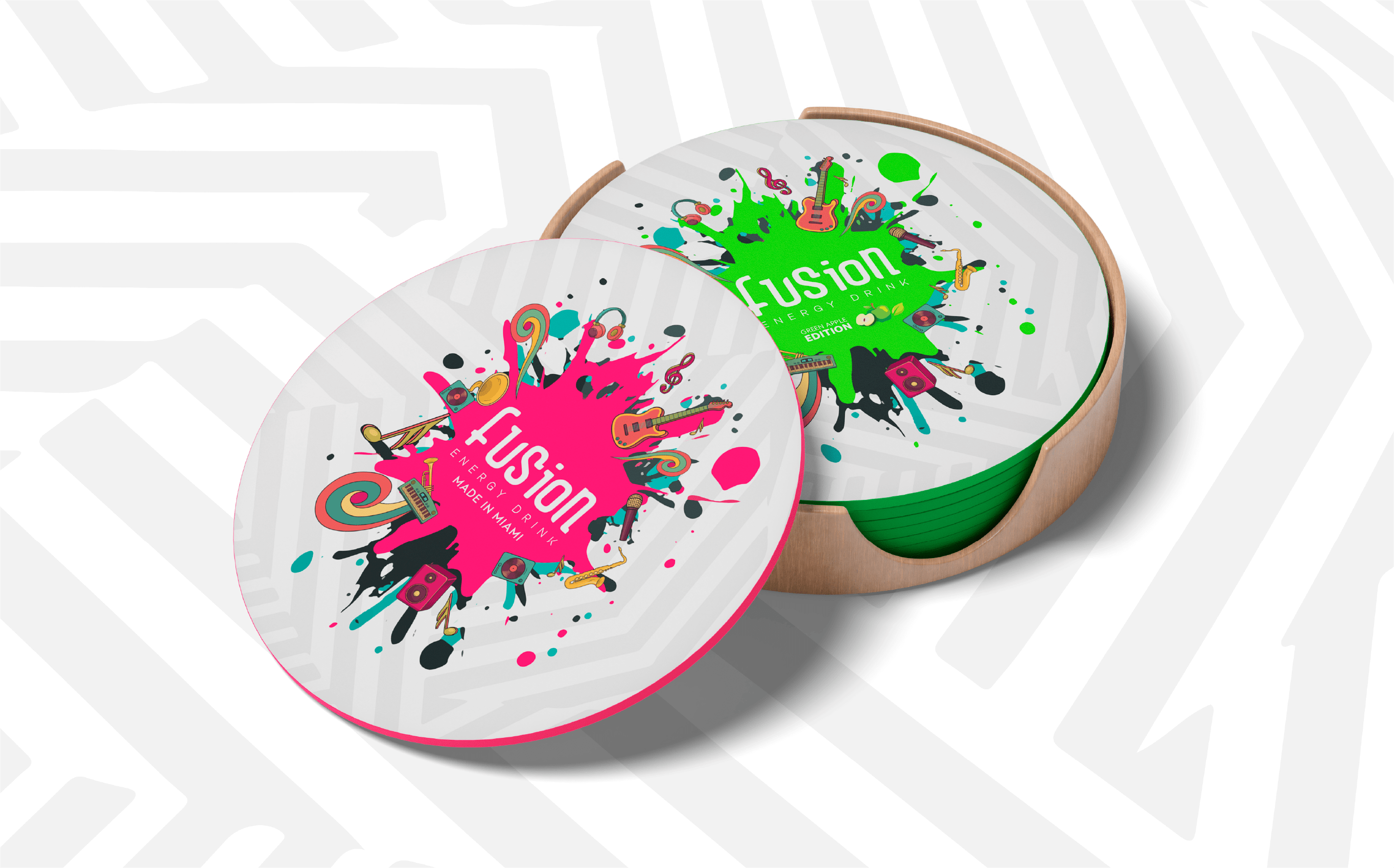
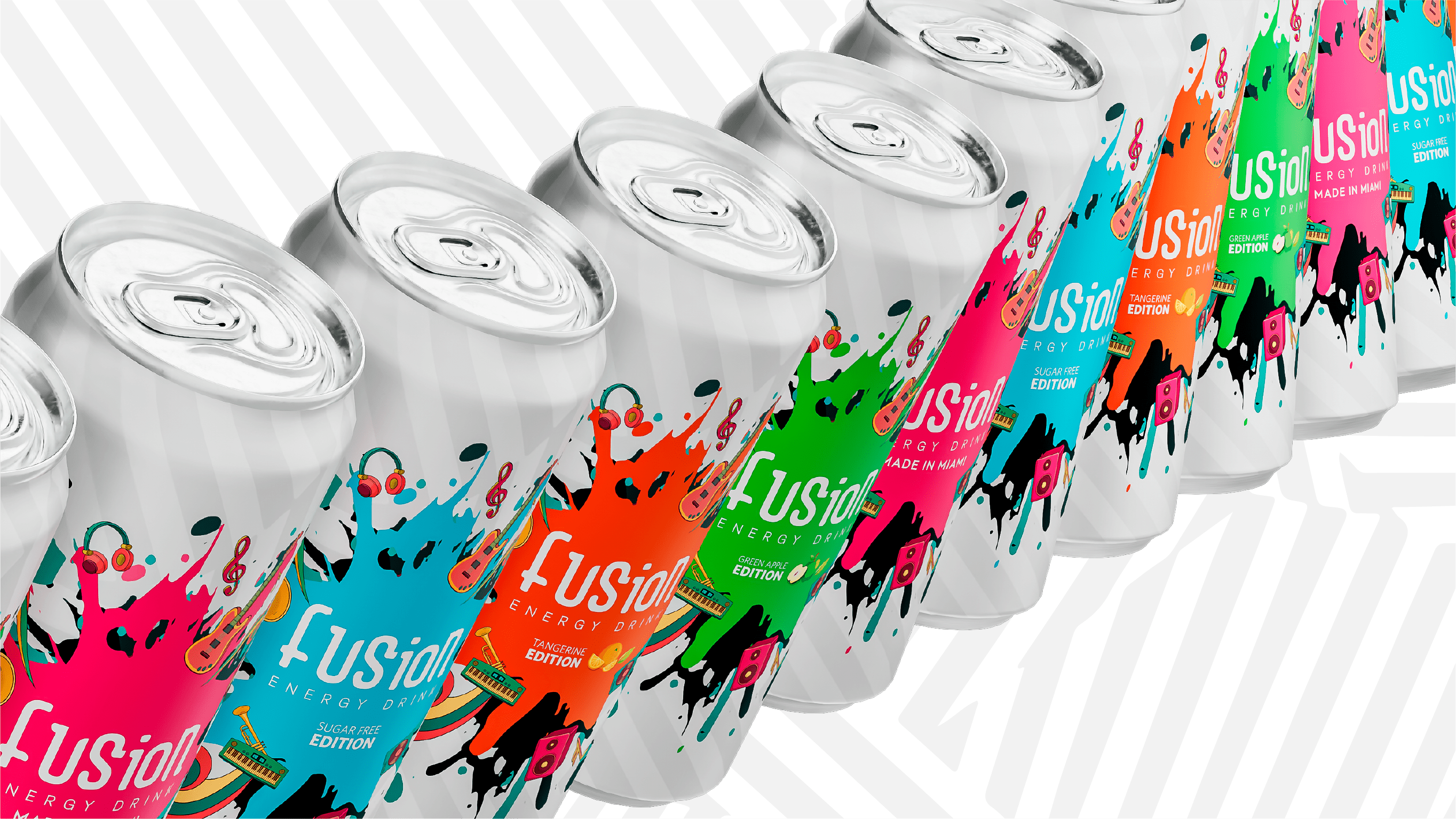
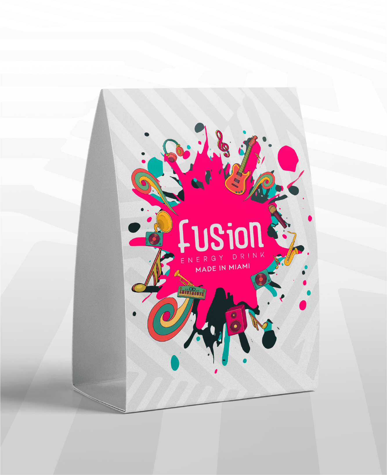
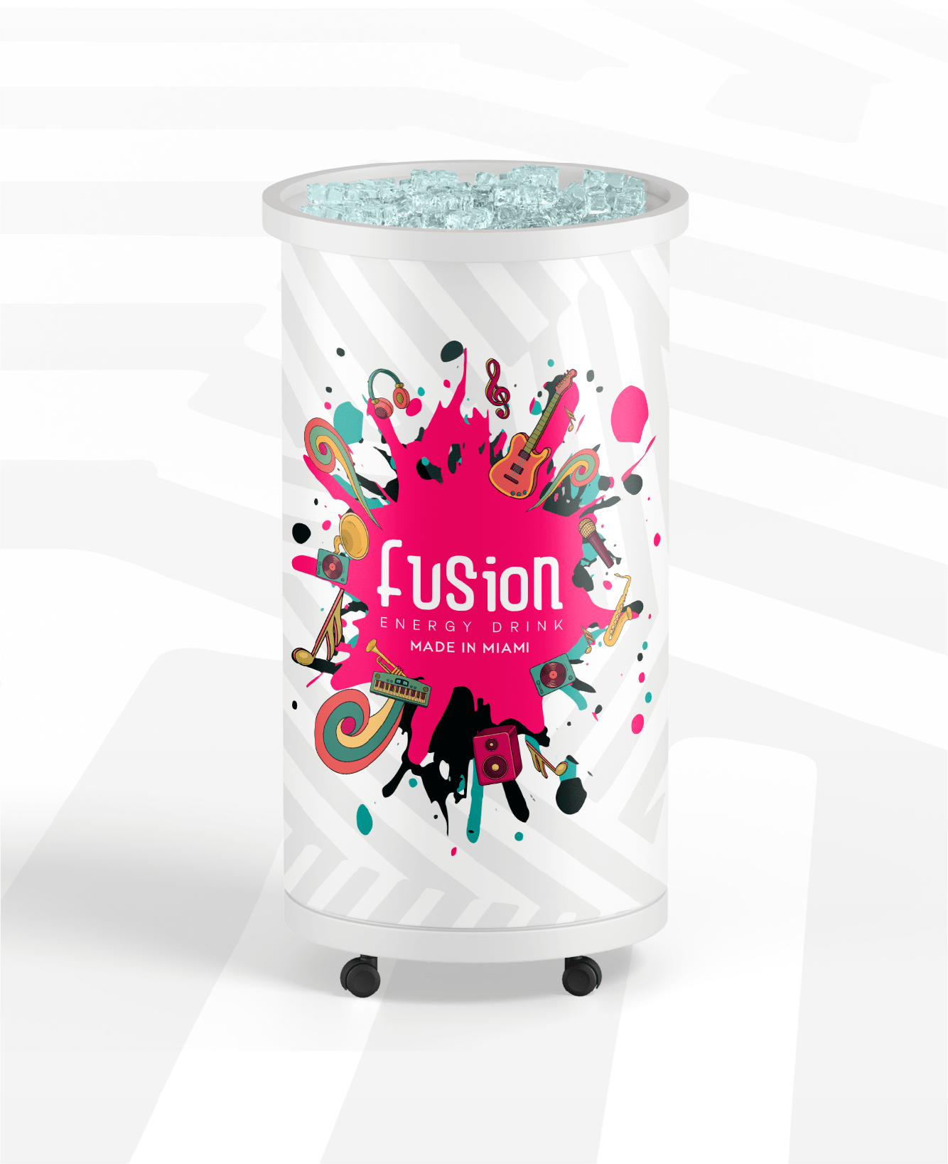
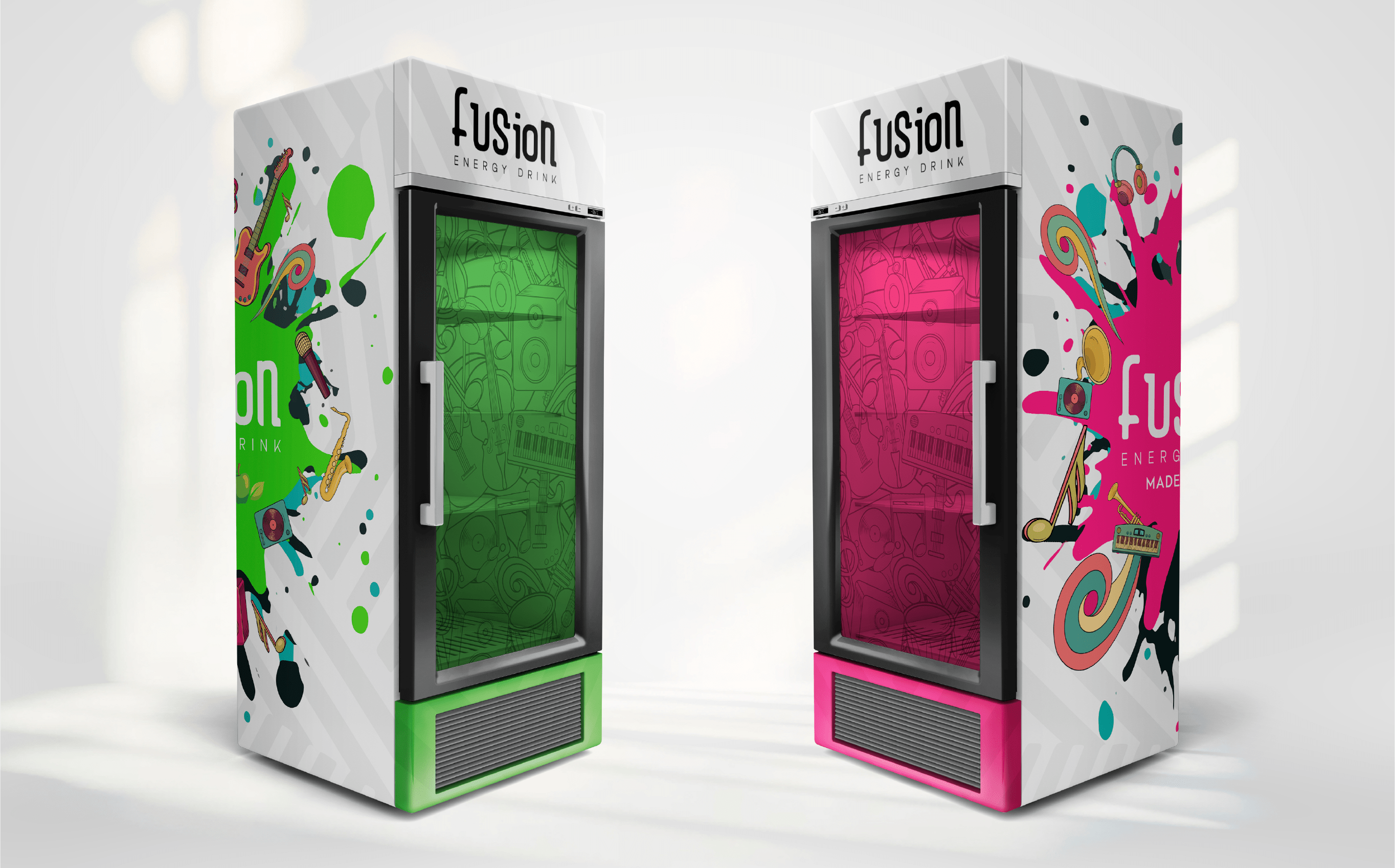
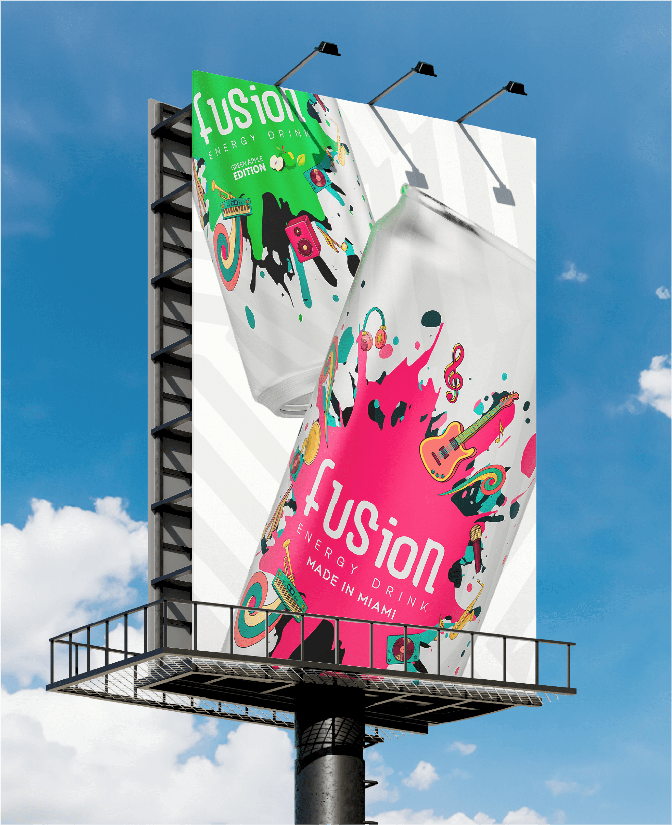
The visual system was built to feel energetic, expressive, and full of personality. Starting with the logo, every element was designed to work together as part of a larger brand experience, from packaging and flavor differentiation to marketing applications.
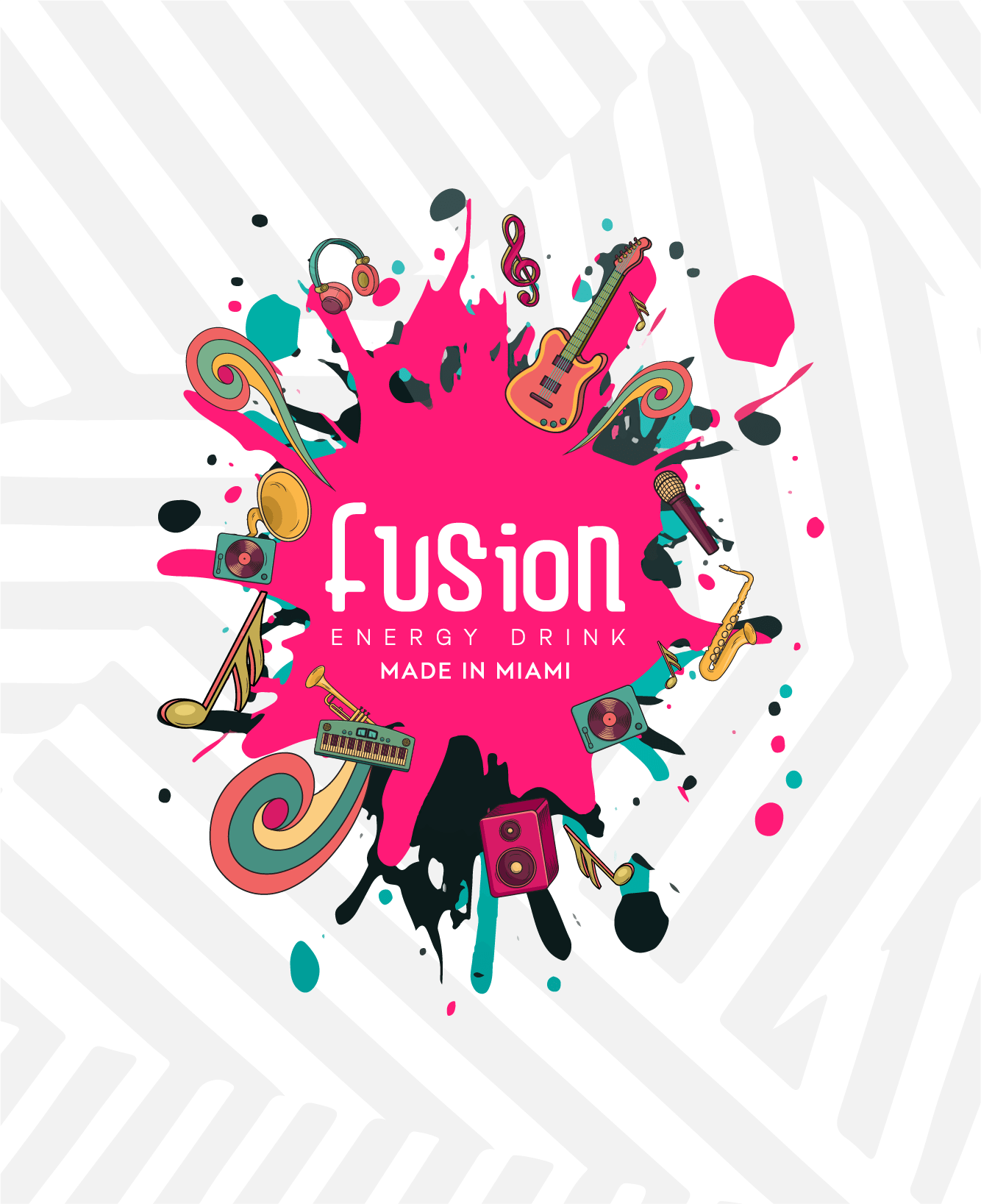
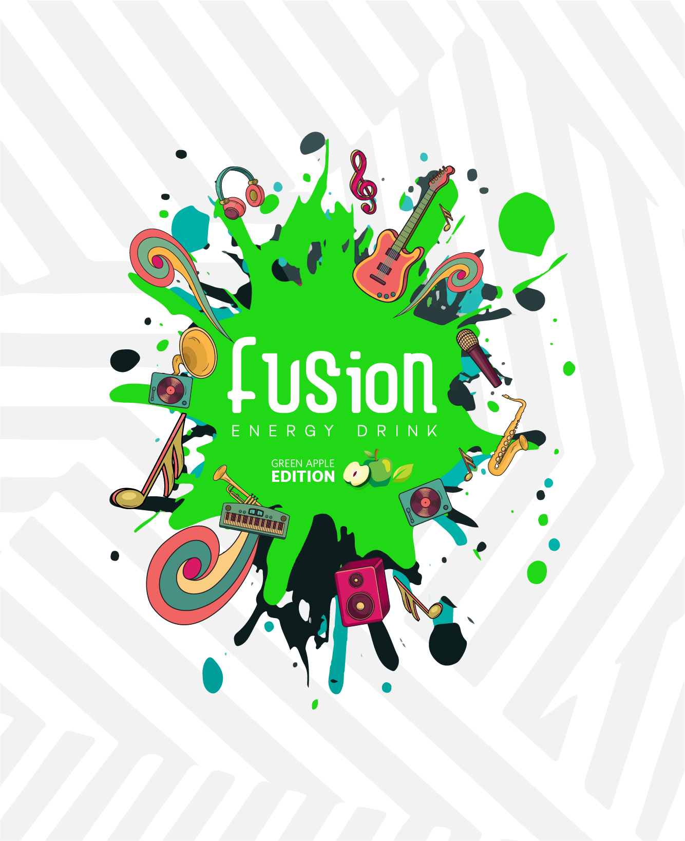
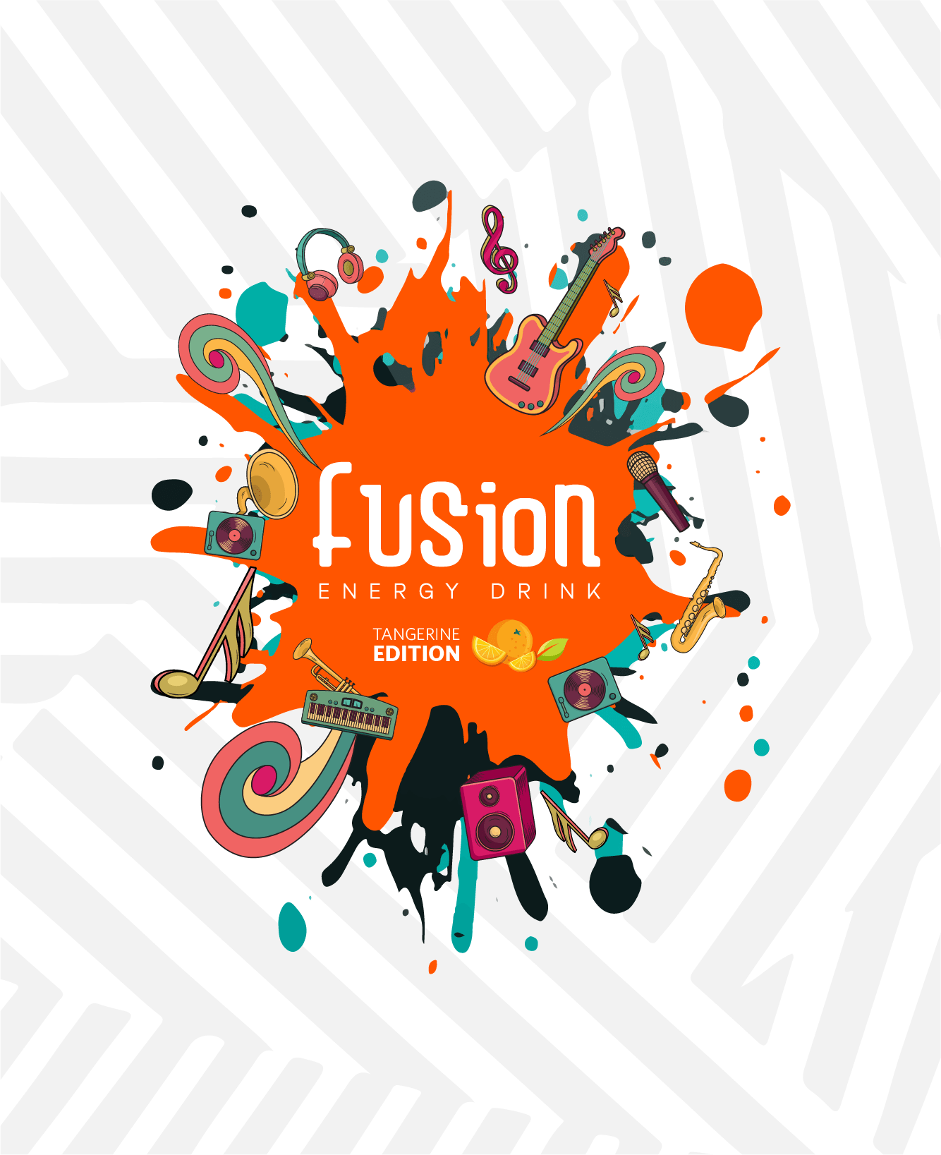
Bold graphics, vibrant colors, and layered compositions became the foundation of the identity. Drawing inspiration from the murals, colors, and visual character found across Miami, the system was built to reveal new details over time while maintaining a strong and recognizable presence.
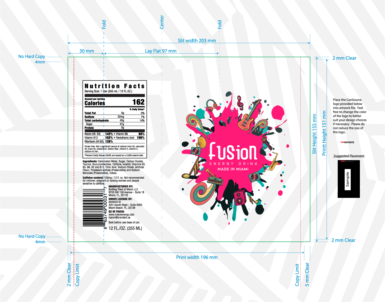
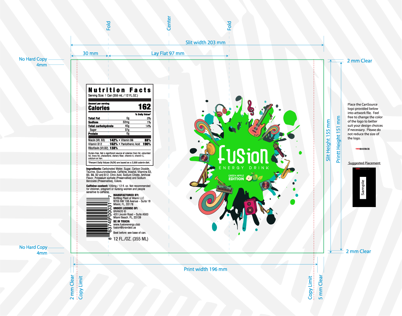
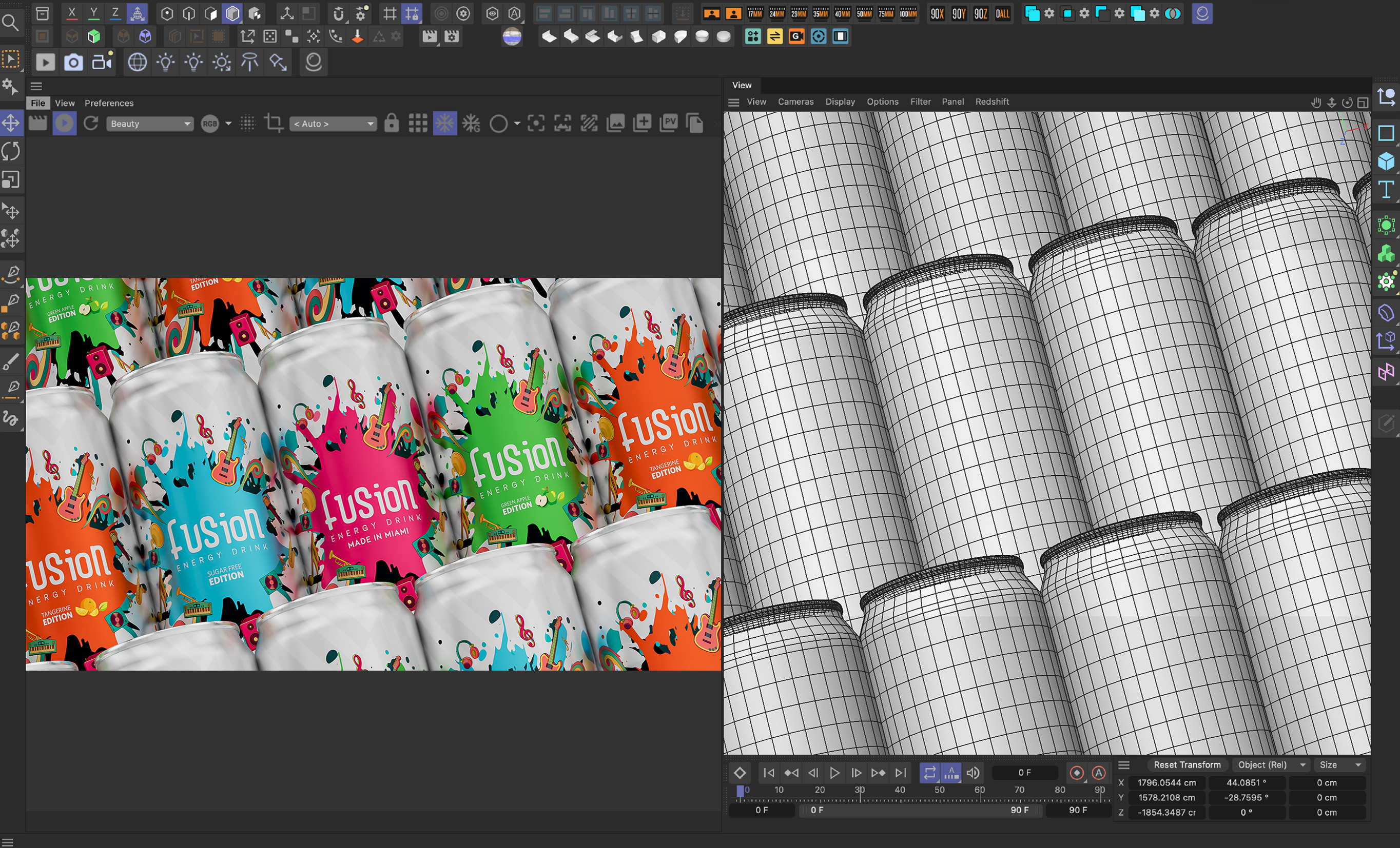
What began as a name and a strategic direction evolved into a fully realized brand experience, from identity and packaging to flavor differentiation and production. Every part of the system was designed to work together, creating a brand with a clear personality and a strong presence on the shelf.
The result was a brand that felt authentic, distinctive, and true to the vision that inspired it from the beginning. Built as a flexible visual system, it created a recognizable presence across packaging, marketing, and digital applications while remaining adaptable as the brand evolved.