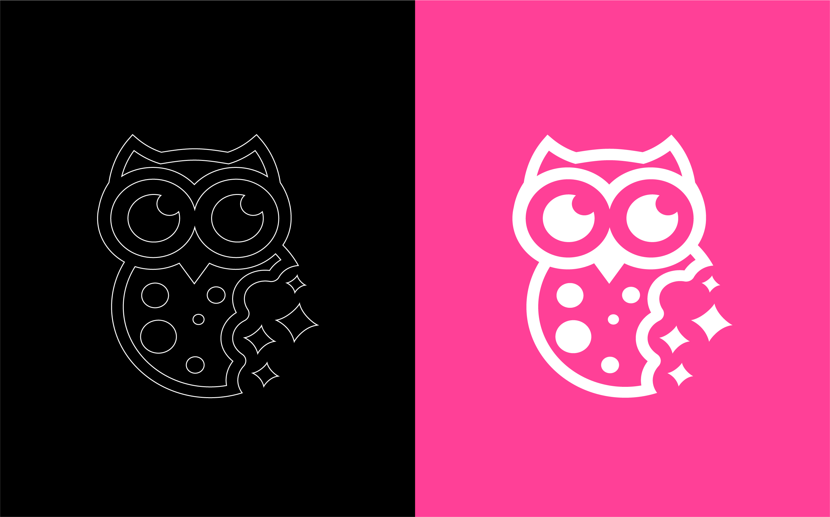
This project focused on a complete rebranding of Night Owl Cookies, aiming to modernize the brand while preserving its original personality. The challenge was to update a logo that had been in use since the company’s inception, which previously featured a more literal and detailed illustration of an owl. The new direction reimagines the owl with a cleaner, bolder design that visually connects the character to the product itself, merging brand symbol and cookie into a single, memorable mark.
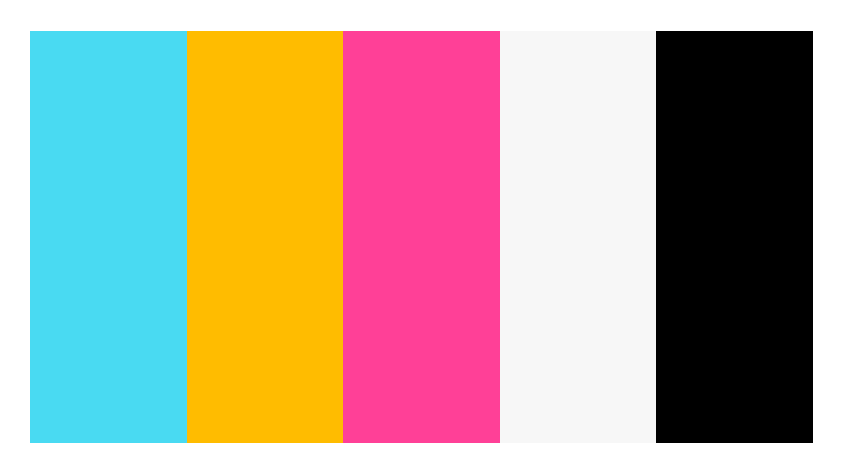
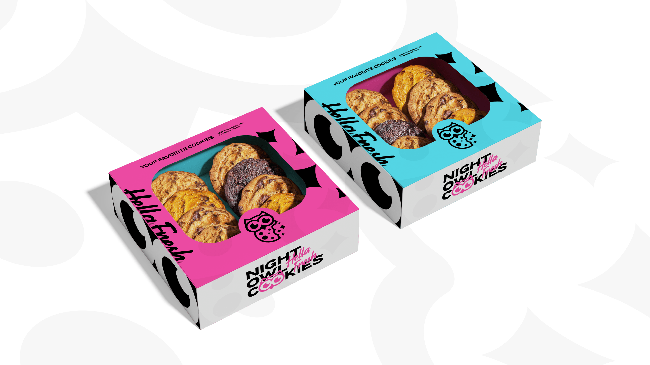
Alongside the new icon, a fresh typeface was selected to strengthen the brand’s voice and improve readability. The existing color palette was refined and enhanced with higher saturation and brightness, bringing more energy, contrast, and playfulness to the visual system. The result is a brand that feels more contemporary, expressive, and instantly recognizable.
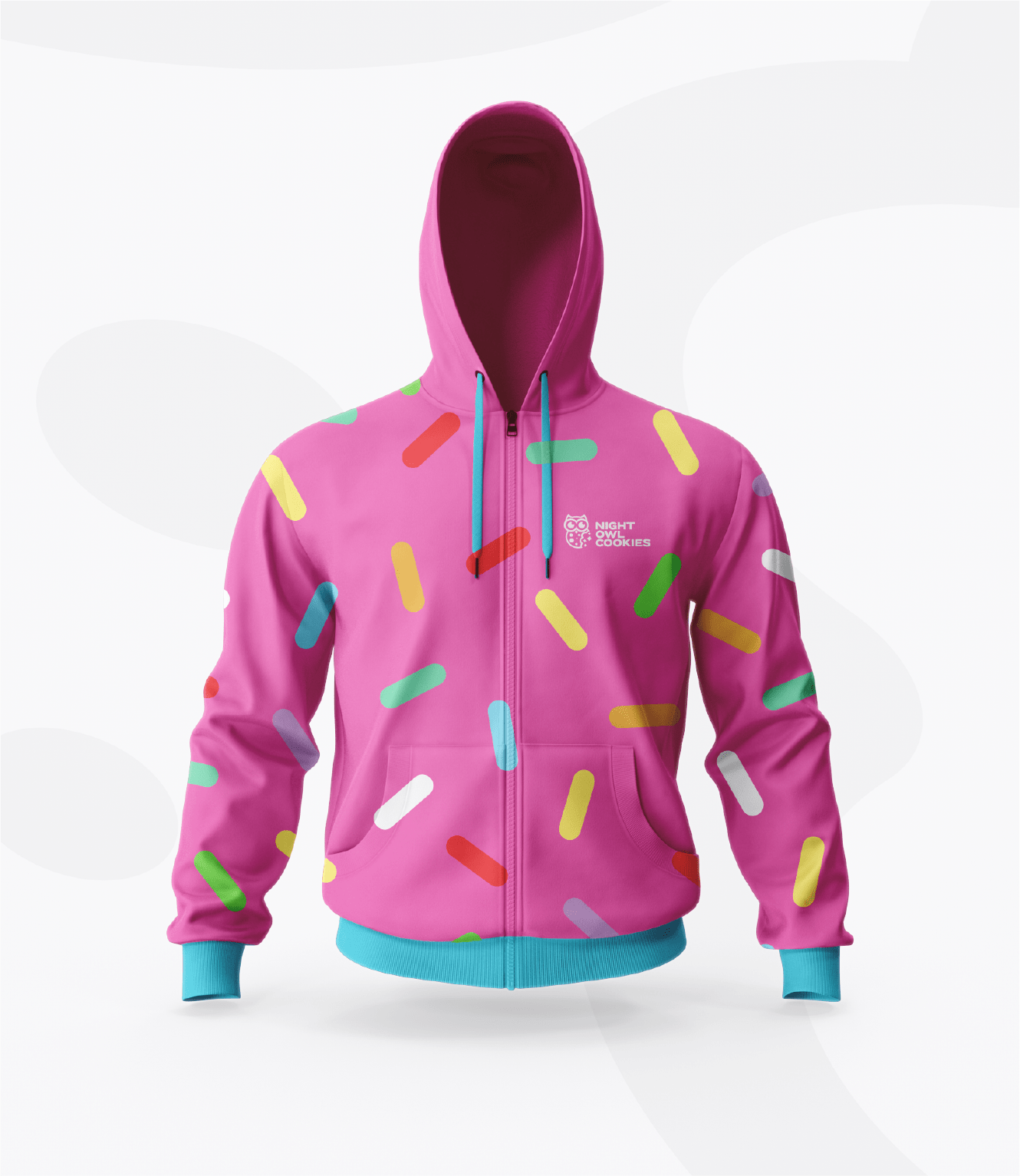
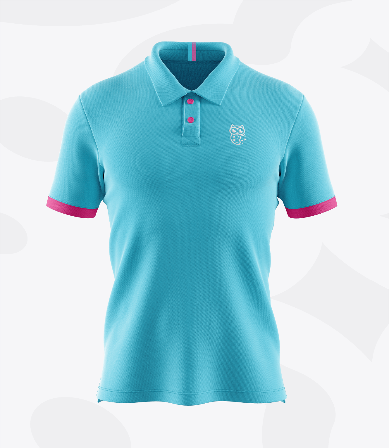
The new identity was applied across multiple touchpoints, including packaging concepts, T-shirts, and hoodies, creating a cohesive and flexible system ready to grow with the brand.