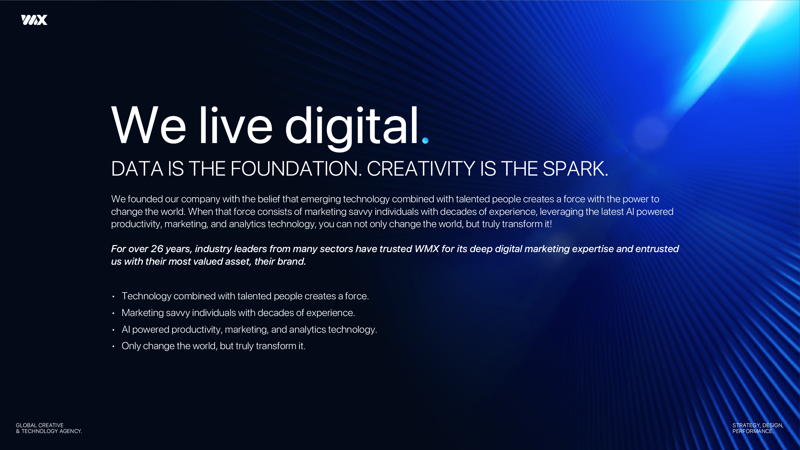
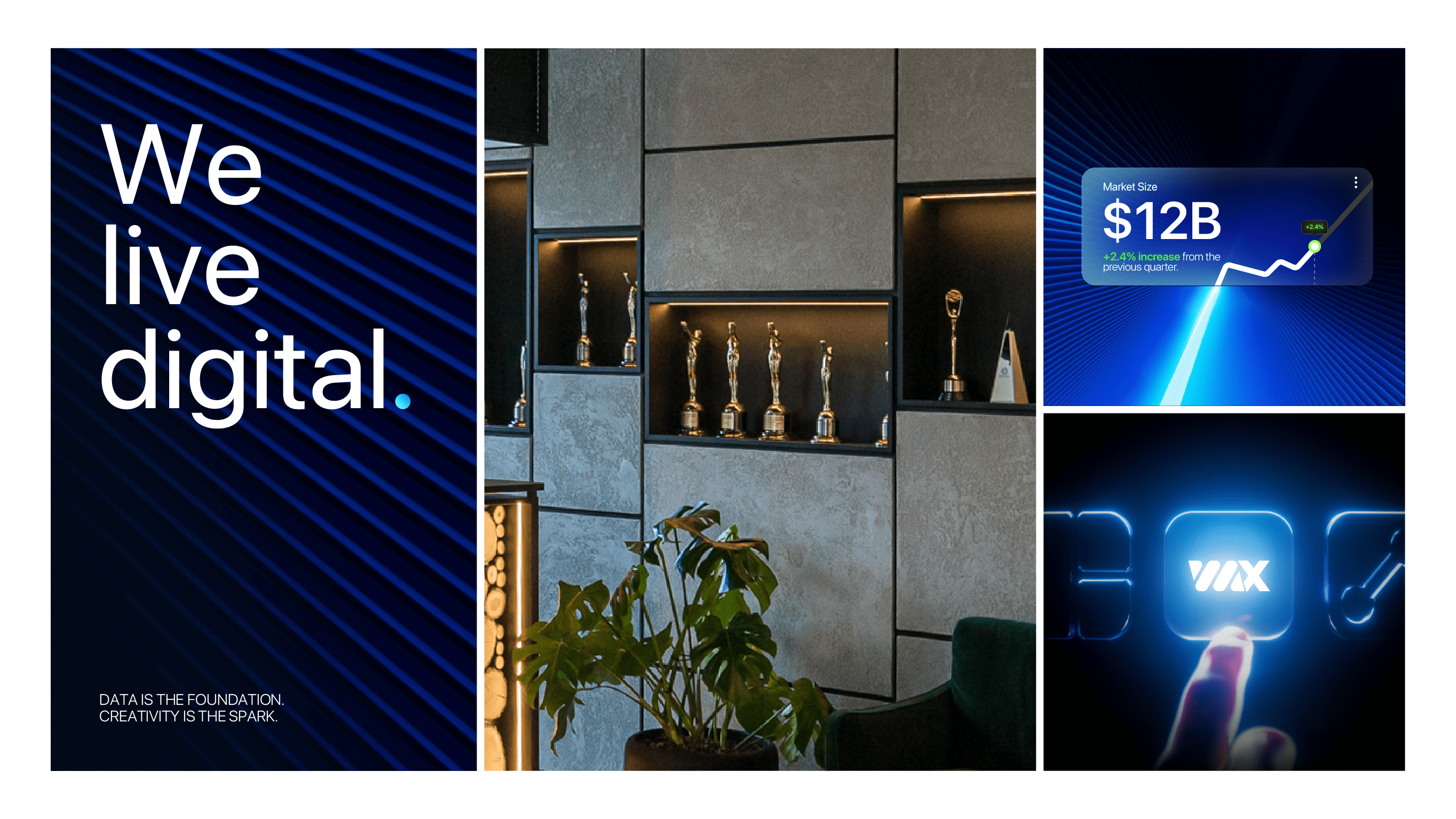
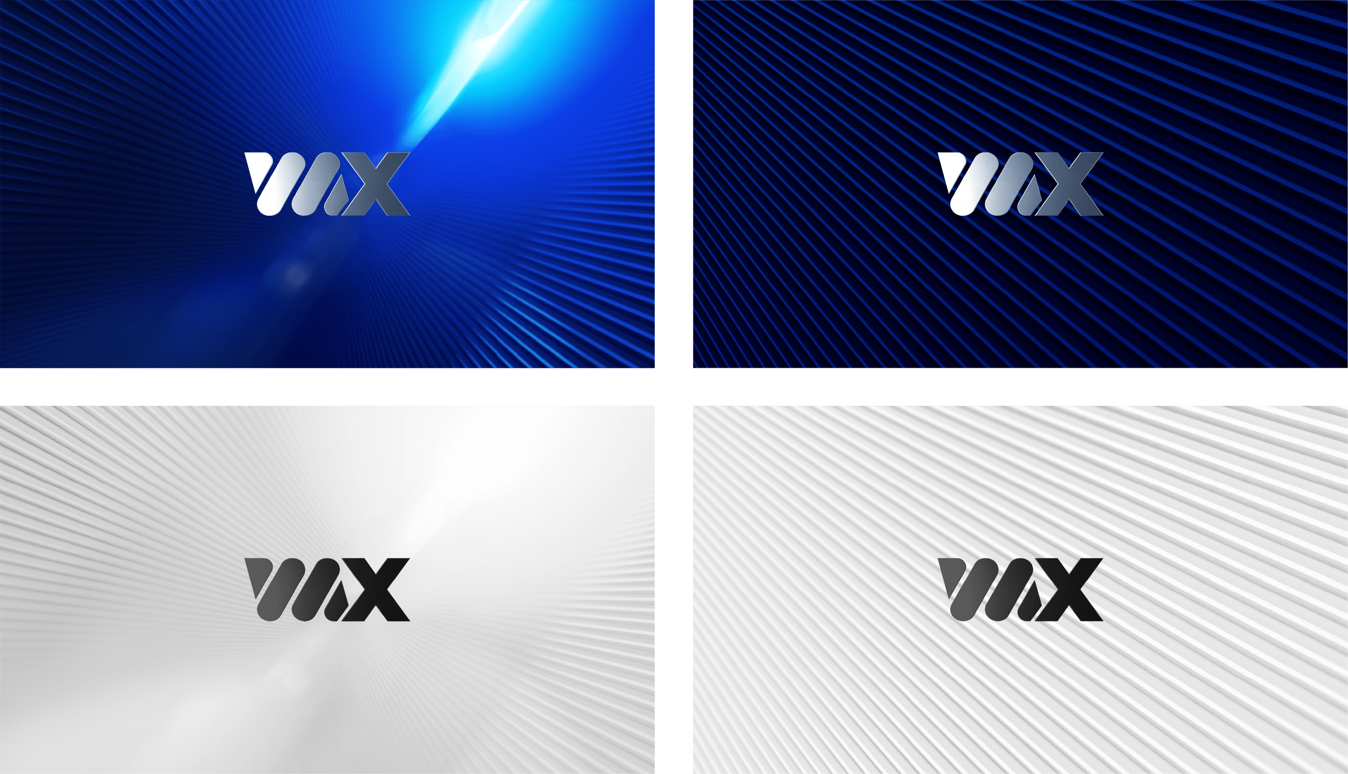
WMX . brand identity

This rebranding project refreshed WMX’s look and feel to reflect its evolution into a digital-first agency. As WMX shifted its focus over the past five years toward digital strategy and performance, the visual identity was updated to feel more modern, relevant, and aligned with its specialization.

The logo received subtle refinements to improve design consistency, while the color palette was fully reworked, removing magenta and introducing tones inspired by light as a symbol of data, movement, and connection. Typography and graphic elements were redesigned to be more digital-native, emphasizing clarity, flow, and connectivity.

The result is a clean, flexible, and contemporary identity that expresses constant transformation and reinforces WMX’s positioning as an agency that truly lives digital.